Evaluation for Film Poster
and DVD Sleeve
Research
At the start of my graphics unit I chose
to make a mind map on the various types of movie genres and hybrids that there
were. I did this because I was unsure of what genre to choose for my poster.
First was the research on the types of genres, and how many there were to chose
from. Then In my proposal I aimed to create a hybrid genre romance/sad film. I
aimed for it to be created in portrait and I intended the age range to be 15.
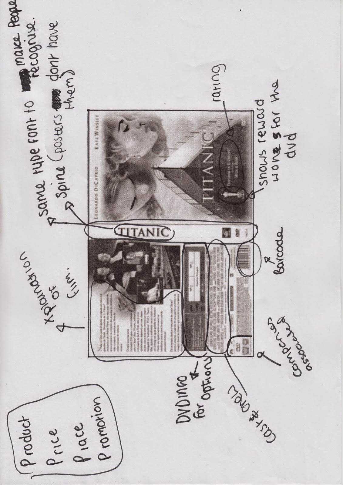
Codes and conventions
I analysed a variety of posters
that had different types of codes and conventions, such as different font looks
and how the posters are displayed and how they look and the message that the
poster is supposed to give. This involved how the poster shows the theme and
how characters are shown on the posters.
Subject genre – romance/sad
I had then decided to create a
hybrid genre romance/sad film poster. Next was planning how I wanted my poster
to look. I wanted to make my poster look like a piece of journal paper, but I
wanted to give it a twist since it is mainly based around a homosexual version
of Romeo and Juliet.
Fonts and titles
For my Font/title I decided to go
to Da-Font and I used the font ‘Always beside you’ by Jonathan S. Harris. Since
I wanted my idea to look a bit like a journal entry I decided to hand draw this
font so that it looked a bit rougher and authentic.
Your written synopsis
‘Romeo Montague (Rylan Hollingworth) and
Julian Capulet (Ashley Willcock) are two lovers drawn apart by Society and
their un-supportive parents. The two star struck lovers have to fight against
the discrimination to live in a free world of equality and happiness. But will
it work out?’
Your sketches and designs – explain how you have worked through your
ideas
I made some basic design layouts,
working on different ideas for my piece. Though I decided not to follow any of
them because I decided to make it look like a redo of the original.
What transferable skills you have developed CS4 applications: Photoshop,
illustrator
The transferable skills I used to
make my work better were illustrator and Photoshop. I used Illustrator to
neaten the Title just a little bit. Though I used Photoshop to overall make the
poster, I used various layers, and I used many tools to make my poster the way
it is. I mainly used ‘scale and ‘rotate, to make the main parts of my poster.
Photography – photo shoots and internet resources
For Photography I used two male
classmates. And I asked them to make themselves look like a couple, and then I
asked for them to look like they were going in for a kiss. I had trouble with
this because they couldn’t keep a straight face; they were finding it extremely
uncomfortable to be nearly 10 centimetres away from each other.
Poster through development – illustrator and Photoshop
The first thing I did was scan the
hand drawn title and I refined the curves on the lettering by using
illustrator. I then began using Photoshop to begin gathering and adding my
Photos and putting them through a series of different layers. Each layer was
altered, by changing saturation and the Hue. To make colours different. I used
Scale and Rotate to make the gun and the photo frame look like they’ve just
been dropped. Each of these steps were also used for the DVD sleeve.
Analysing the finished product- both film poster and DVD sleeve
For my finished movie poster I
think that the positives on it is that it turned out exactly as I imagined it.
Although there was one negative thing I didn’t like about my poster, and that
was that it didn’t look finished in my opinion when I looked back at it a few
weeks later. On terms of the layout, I’d say that I positioned the images that
were in my poster correctly; I wanted to make it look almost similar to the
original film, So I had to make sure that the frame and its picture were placed
correctly, that the flag was right and that it wasn’t too bright to over power
the poster, and to make sure that all the images had connections to the film I
created. For fonts I needed to make sure that it was romantic and suited the
display. I personally think that the font made the poster look more suited to
the genre of the film; it gives off a sort of happy emotion. The people I
included in this were told to break the stereotypes and they had to move as
close as they could to give off the look that they were a homosexual couple. I
asked my models to give off the body language that they were a couple, and to
compose themselves whilst having the picture taken so that they could make the
image look real.
As for my DVD sleeve I think that
the positives are that it fits with the front cover and I have managed to suit
the look to the actual genre of the film though the one negative I had with my
DVD sleeve was that it looked empty, I could tell it was completed but it
looked empty because there was still a bit too much open space.